Thursday 24 March 2016

Connecting Essay Two


I took this photograph at a Water Mill in Hertford, I really enjoyed this shoot because the scenery was very pretty. I think the two photographs are quite similar, however there is no buildings in Godwin's photograph whereas there are in mine. I think that her photograph shows two sides to rural England, some of it is incredibly lush like on the right of her photograph, whereas in contrast the left of her photograph looks quite barren. I think my photograph also shows a sort of contrast, on the right it is quite lush and green whereas on the right we can see a building, I think that this shows urbanisation and how there is starting to be a lack of green spaces in cities.

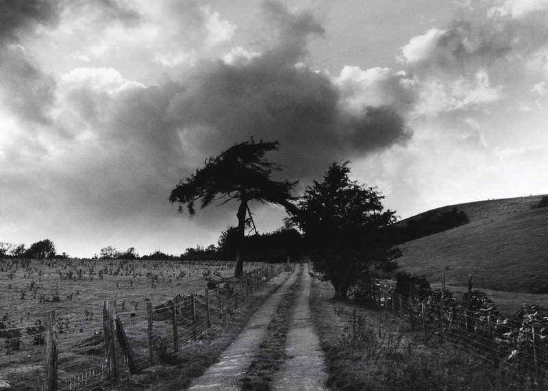
Fay Godwins photographs are always in black and white, they also show the environment in its raw state. I think that her photographs are really nice because they show the British environment in a beautiful light. I would enjoy doing this sort of shoot for my final shoot and I would like to try this out in an even more rural area, this shows sustainability because we should be leaving areas rural like this for future generations to enjoy and for animals and plants to be able to thrive.

Shoot Four - Contact Sheet


Shoot Three - Contact Sheet


Wednesday 23 March 2016

Connecting Essay One

This is my photograph and I took it inspired by Rut Blees Luxemburg, I think that these photographs are really nice and I would like to do something similar to this for my exam piece. I took these photos to show cars as a way of traveling, I am going to do a photoshoot of bikes in contrast to this, one showing sustainability and one showing over consumption of fuels. I really like the photographs I took, however to get a better effect like in Luxemburg's photographs, I would have to leave the exposure time on longer, for this to work I will have to go out when it is quite dark because otherwise it will be over exposed.

This photograph is of car lights on a road, however they are quite faint so you might not notice them straight away, this is in contrast to mine where the lights are very obvious. I think my photograph and Luxemburgs photo are similar because they both show car lights, they are also similar in colour, I edited mine to look more yellow by using colour balance, I think that this was a big improvement on the original photograph, the original photograph is good but it looks too light as I didn't go out when it was dark enough. Next time I will go out later when it is properly dark so that I can get a better series of photographs, I also think that I will use a longer exposure time so that I can get a effect more like Luxemburg's.


Shoot Two - Contact Sheet


Tuesday 22 March 2016

Shoot One - Contact Sheet


Shoot Six - Final Images


Shoot Six - Contact Sheet


Shoot Five - Work Record

Evaluation:

For this photograph I went to the bridge above the M25 near me, I brought a tripod with me so that I could do long exposure shots but my tripod was difficult to use as I had never used it before, so I decided to just lean it on the railing.
I took this photograph to show cars as an unsustainable means of travel, I think that this photo shoot went really well because I took a large amount of photos and many of them were good quality.


This is my best photograph from the shoot in my opinion, I have edited it too look more like Rut Blees Luxemburg's photography because I really like her style and the way she uses colour. I also like this photograph because it shows an equal amount of red and white lights on each side, which looks better than an unequal amount. I didn't take this using a tripod because, although I have one, it wasn't what I was used to and I couldn't keep it still to take the photograph, so for this photograph I leant it on the raining of the bridge.
The camera settings were:
Shutter Speed: 1.6 seconds
F stop: 14
ISO: 200

This photograph is my worst from the shoot, it is under-exposed which means that it didn't get enough light and is way too dark. It is also very shaky which also looks terrible, I should've checked my camera settings properly before taking this because they obviously weren't very good.
The camera settings:
Shutter Speed: 1.6 seconds
F Stop: 32
ISO: 200 

Progression:
Next time I will go out later because I don't think the photographs came out in the colours I wanted, which is why I had to edit them so much. Next time I will go out later because that way I can use a longer exposure time and have the car lights go further as this will improve the image immensely.

Shoot Five - Final Images


Shoot Five - Contact Sheet


Thursday 17 March 2016

Shoot Four - Work Record

Evaluation:

For this photo shoot I visited a local petrol station, I think that these photographs look really good, the angles I took the pictures from are really nice angles because I was able to take photos from any angle, it was not restricted into a corner where I could only get one angle of the station. The colours of the petrol station were too bright in my opinion, but I was able to make them a bit more muted on photoshop which looked better. 

I think that this photograph is my best, it has lots of leading lines which drags the eye, including the sign which is on the rule of two thirds line, this means that the eye sees it more that it would see the tree in the middle of the photograph.
Camera settings:
f stop: 8
ISO: 200
Exposure: 1/800 secs

This is a similar photograph to my best one, however it is probably my worst, I didn't fit the entire board in which doesn't look very good and in addition to this, the grey sign next to it is very eye-catching and I think that it is a much busier photo because of this.
Camera settings:
f stop: 8
ISO: 200
Exposure: 1/1000 secs

Progression:
Next time, I would like to take these photographs at night, because I think that the lighting would be a lot nicer, I also think that the photographs looked very warm when I first took them, which I didn't think looked very good.

Shoot Four - Final Images